
Council On Foundations
The Council on Foundations is a nonprofit membership association that serves as a guide for philanthropic organizations as they advance the greater good. As part of their 2021-25 strategic direction, we created a new identity to help the Council show up in a bold new way as they progress against their goals.
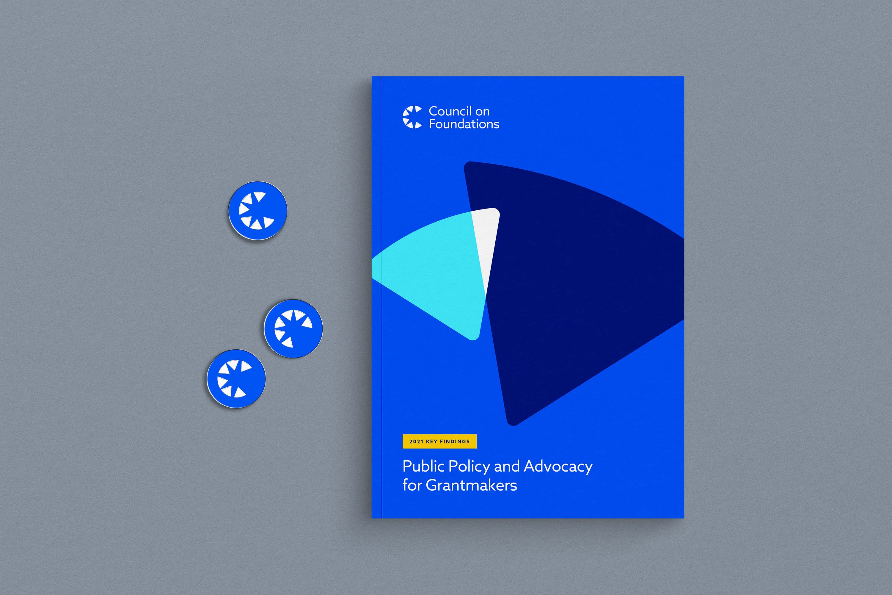
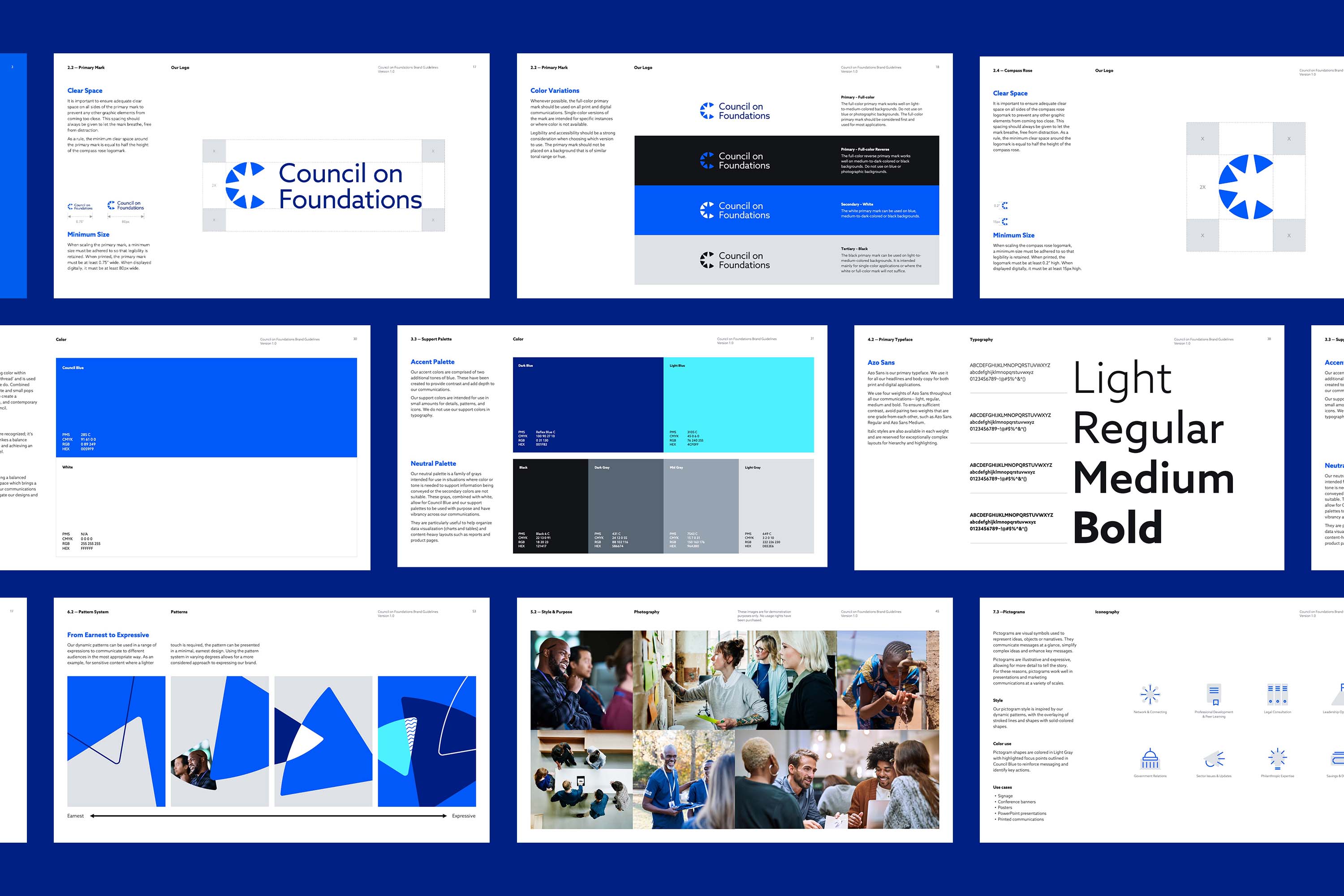
The logomark is a nod to the Council’s brand promise of being a basecamp for their members, with the triangles forming an aerial view of tents huddled around a central point, while the negative space forms a compass rose, symbolic of the Council being a motivating guide.
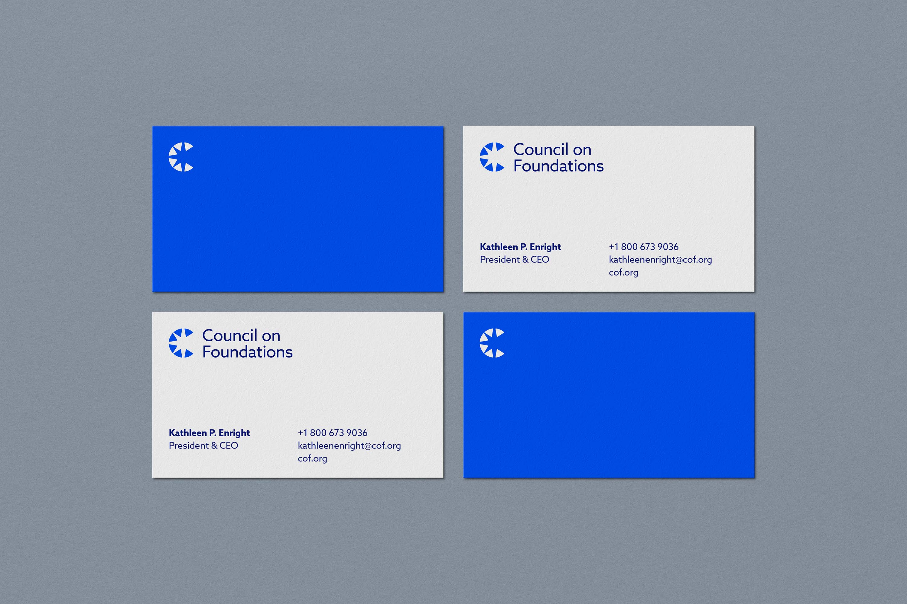
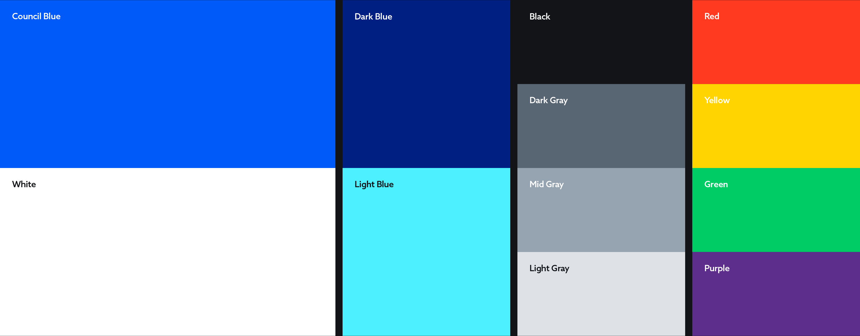
A vibrant blue acts as the primary identifier of the brand, with dark blue and light blue used to round out a distinctive color palette that is centered around approachability.
The Councils' design system is centered around patterns that are formed when the shapes that make up the logomark interact with each other.


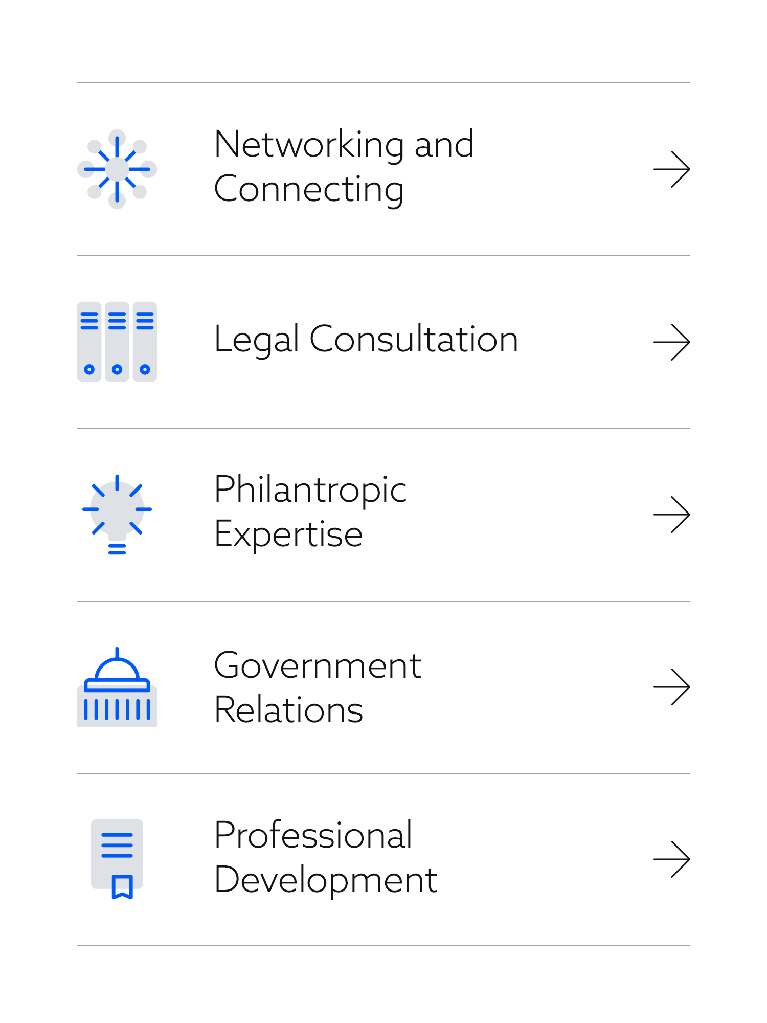
As part of the extended visual language, pictograms are used to help communicate the core benefits of joining the Council.


©2022